

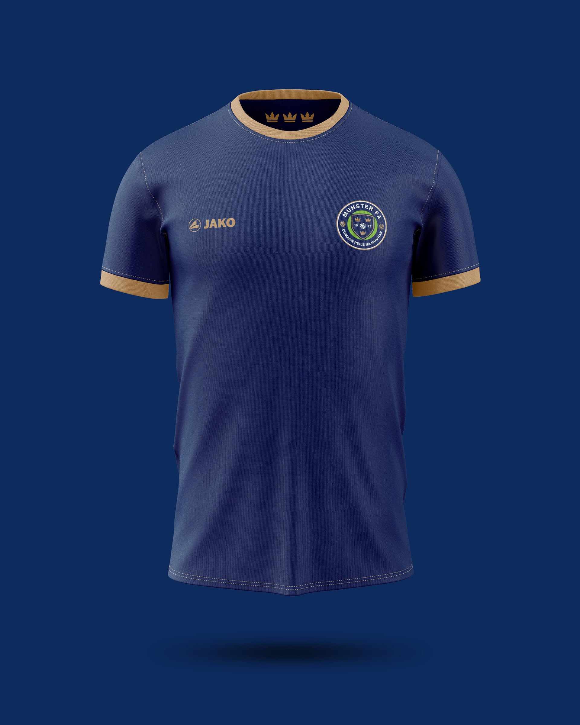
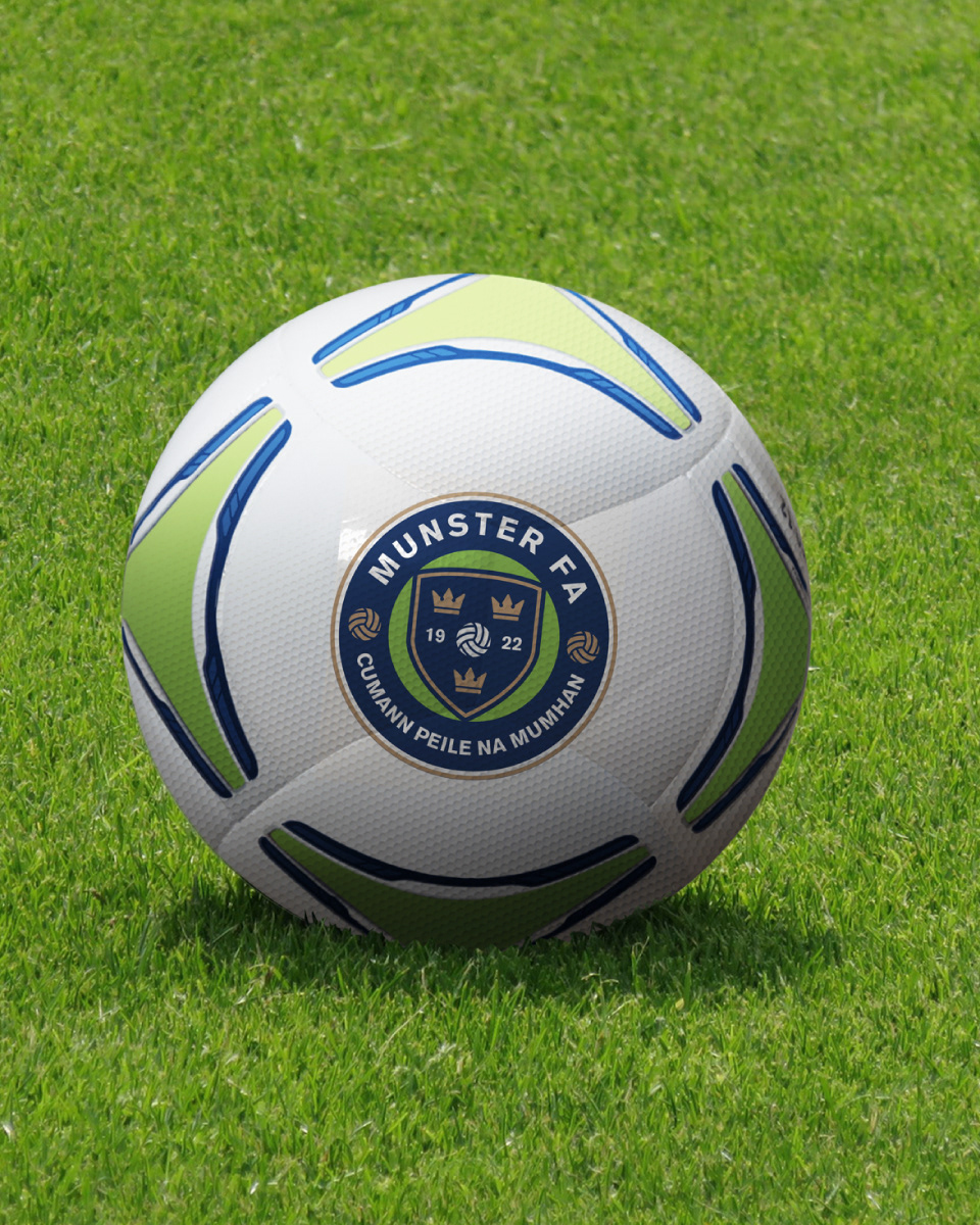
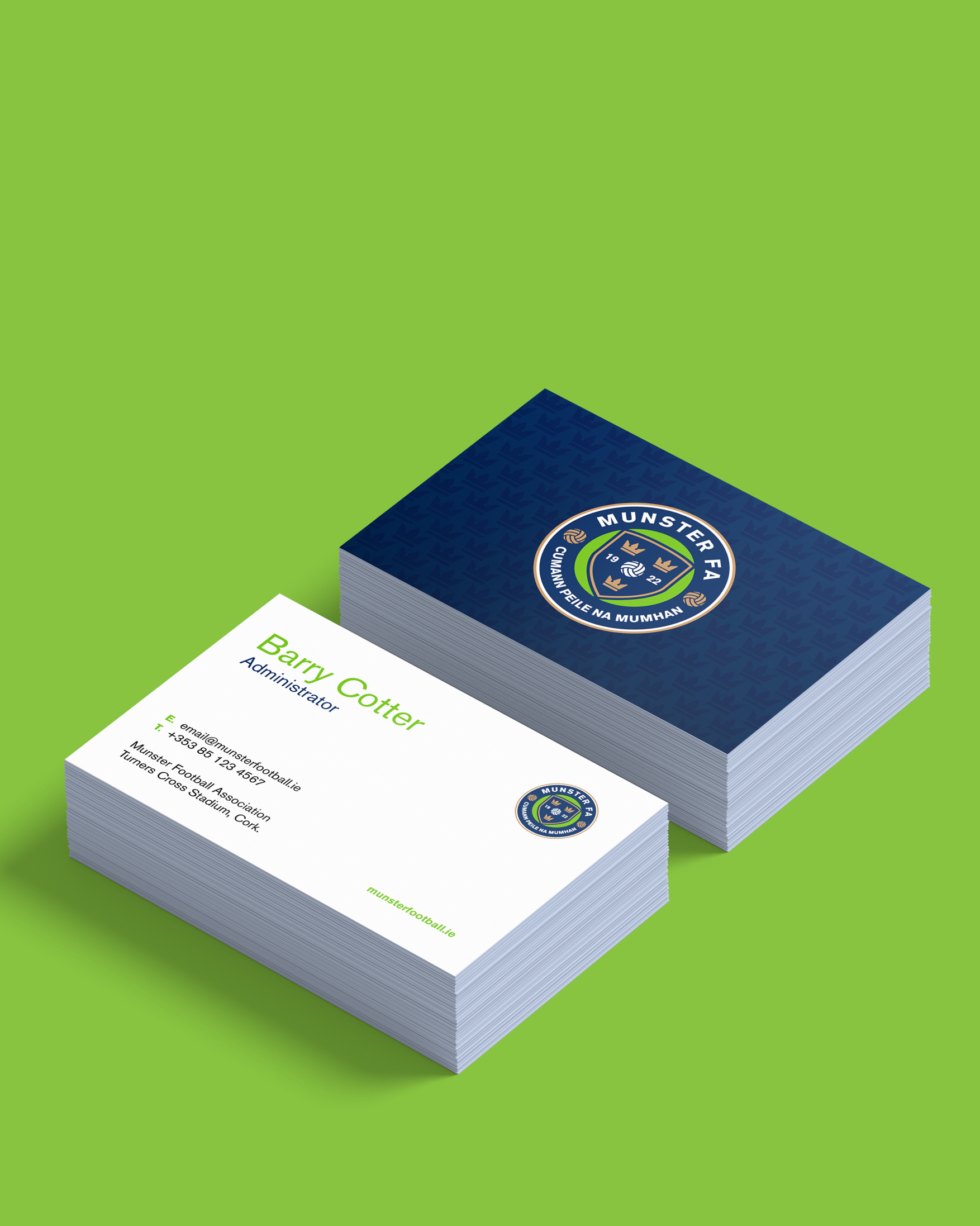
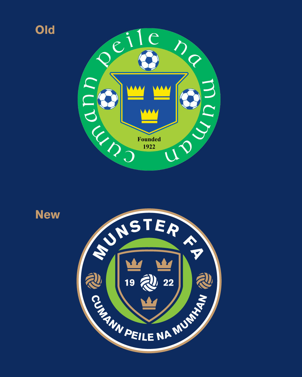
The redesign of the Munster FA Crest was a journey rooted in honouring tradition while embracing modernity. As the visual identity of one of Ireland's most storied football associations, the crest needed to reflect the rich history of Munster football while appealing to a contemporary audience.
One of the biggest challenges in redesigning the Munster FA Crest was maintaining a connection to its iconic history while creating a design that felt fresh and relevant. By simplifying the layout, modernising the typography, and reimagining key symbols, the new crest achieves a timeless quality that bridges generations of football fans.
One of the biggest challenges in redesigning the Munster FA Crest was maintaining a connection to its iconic history while creating a design that felt fresh and relevant. By simplifying the layout, modernising the typography, and reimagining key symbols, the new crest achieves a timeless quality that bridges generations of football fans.
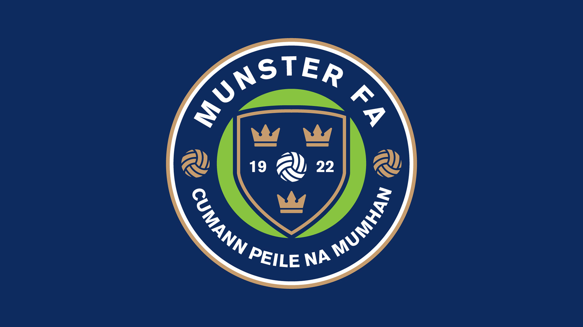
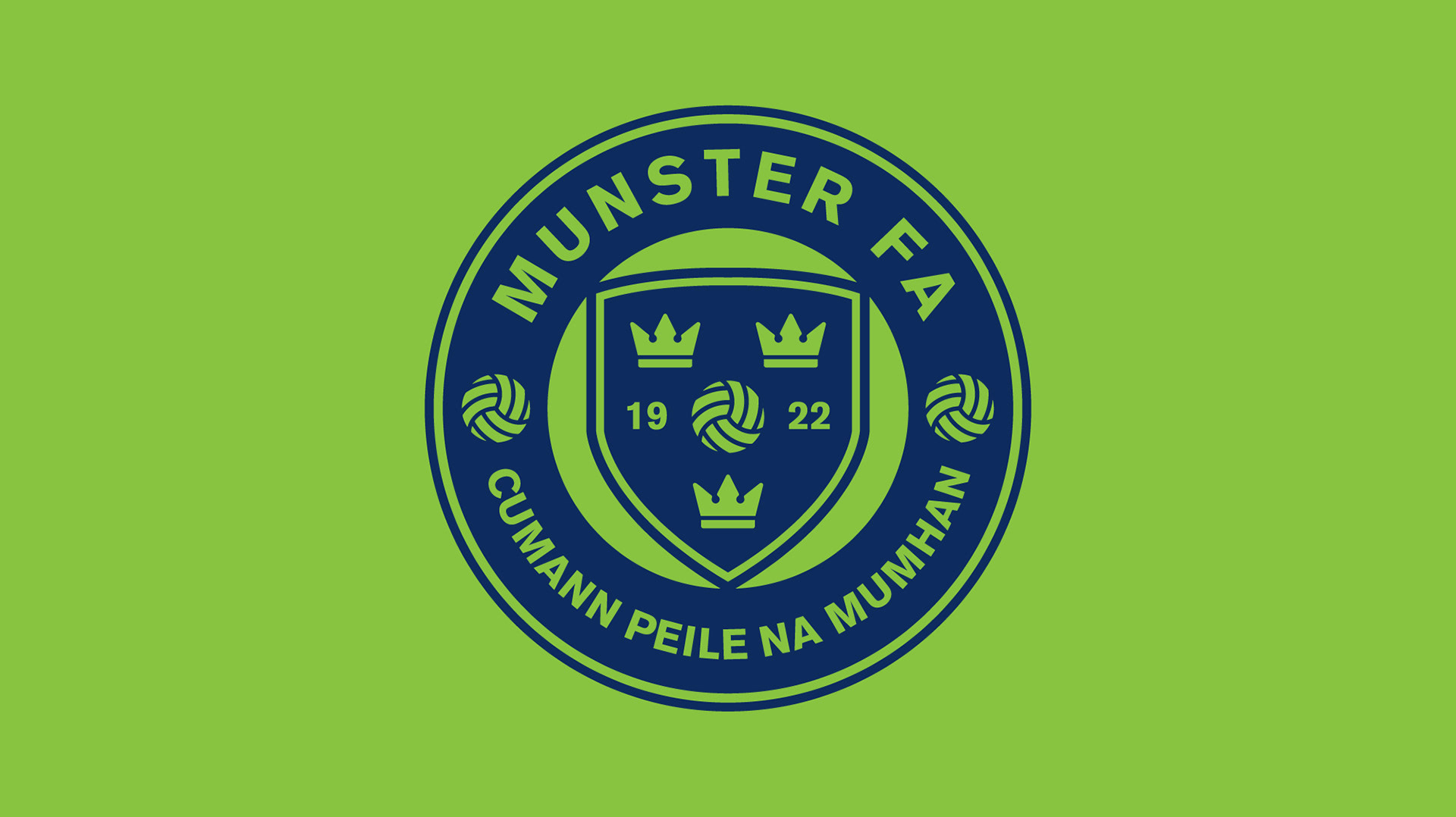

Redesigning the Munster FA Crest was a deeply rewarding experience that reminded me of the power of design to connect people and tell stories. It was a privilege to work on a project that carries such significance for so many, and I’m excited to see how the new crest will inspire future generations of football enthusiasts.